Let’s be brutally honest: Nobody wakes up excited about their “conversion funnel”—until it’s leaking hard-earned traffic all over the place, and every upward tick in ad spend brings diminishing returns. Sound familiar?
If you’re an eCommerce marketer or owner, you already know the basics: attract, engage, convert, and (hopefully) nurture. But here’s the twist most folks miss—what separates those who simply have a funnel from those who crush their revenue goals is their obsession with thoughtful UX design at every single touchpoint. And I’m not talking about pretty visuals for the sake of it. I mean frictionless, user-obsessed, data-driven design choices that guide your customer from “just browsing” to “Add to Cart” without a hiccup.
Recent case studies (trust me, we’ll get to Blikket’s numbers in a sec) prove that getting granular with UX insights—like heatmaps, session recordings, and behavior analytics—can stop funnel leaks and actually increase conversions across every stage of your conversion funnel. In a landscape where your competitors are a single tab away, refusing to optimize is like leaving money on the table and hoping nobody notices.
So, if you want more than just another “pretty” site—and you’re ready for practical, actionable strategies that actually boost the one metric that matters (conversion)—you’re in exactly the right place. Let’s break down how UX can radically transform your conversion funnel from top to bottom (and help you finally stop the leaks).
Ever wondered why some eCommerce websites seem to effortlessly turn casual browsers into loyal customers while others struggle to keep visitors engaged? The secret often lies in the art of User Experience design. In the bustling world of eCommerce, UX design isn’t just a buzzword; it’s a strategic tool that can make or break your business’s success. And at the heart of this strategy is the conversion funnel—a roadmap that guides your visitors from awareness to action.
So, what exactly is a conversion funnel? Imagine it as a journey your potential customers embark on, starting from the moment they become aware of your brand to the final step of making a purchase. It’s a visualization of stages that potential customers pass through, helping businesses identify where they might be losing prospects and how to nudge them closer to conversion. But why focus on UX design at each stage of this funnel? Because every touchpoint is a chance to enhance the user journey and maximize conversions—something we delve into deeply in our Funnel Analysis at Blikket.
Consider the role of UX design in the conversion funnel as akin to a well-placed signpost guiding visitors through a marketplace. It’s about creating a seamless and intuitive experience that reduces friction and keeps users moving forward. Each stage of the funnel—awareness, interest, desire, and action—offers unique opportunities to engage users, and optimizing UX at each step can be the difference between a sale and a missed opportunity.
At the awareness stage, the goal is to capture attention and introduce users to your brand. Here, UX design plays a crucial role in making your website attractive and easy to navigate. It’s like the “welcome” sign that invites visitors to explore further. Moving down to the interest and desire stages, the focus shifts to maintaining engagement and showcasing the value of your offerings. This is where a good UX can keep users intrigued and willing to learn more about what you offer.
Finally, at the action stage, UX design becomes the friendly salesperson, ensuring that the path to purchase is clear and compelling. Whether it’s through easy navigation, quick loading times, or persuasive call-to-actions, a well-optimized UX can significantly influence conversion rates, as highlighted by the insights from our User Flow and Usability Testing practices.
Ultimately, integrating effective UX design into every stage of the conversion funnel is about crafting an experience that feels personal, intuitive, and rewarding. It’s not just about getting users to the end of the funnel—it’s about guiding them smoothly and efficiently, ensuring that they not only reach the finish line but do so with a positive impression of your brand.

Mapping the conversion funnel is much like plotting a roadmap for how a casual browser becomes a devoted customer. Each stage of the funnel—awareness, interest, desire, and action—plays a pivotal role in this journey, and effective UX design is your guide at every step.
Awareness: The Starting Line
The journey begins at the awareness stage, where potential customers first encounter your brand. Think of this as the “hello” of your digital storefront. Your goal here is to make a lasting first impression, capturing attention through engaging content and intuitive navigation. It’s crucial to utilize AIDA model principles to craft messages that resonate and create brand awareness, laying the groundwork for deeper engagement.
Interest: Piquing Curiosity
Once you’ve captured attention, the next step is to nurture interest. This phase is about diving deeper into what makes your offerings special. Here, UX design should focus on providing valuable content—think how-to guides, insightful articles, or engaging videos—that speaks directly to the needs and desires of your audience. Make sure your website’s design is both visually appealing and easy to navigate, enticing visitors to explore further as they move through the funnel.
Desire: Creating Emotional Connection
The desire stage is where potential customers start envisioning themselves using your product. This is where UX design can create an emotional connection by highlighting the unique benefits of your offerings. Use targeted campaigns and personalized content to show how your products or services can improve lives, fostering a sense of urgency and excitement. It’s akin to giving your visitors a taste of what they can have, making them want it all the more.
Action: Sealing the Deal
Finally, the action stage is where decisions are made and transactions occur. A well-designed UX can make this stage seamless and stress-free. Ensure that calls to action are clear and compelling, guiding users towards making a purchase or signing up. Effective UX design here minimizes friction, whether through streamlined checkout processes or persuasive content that reassures and motivates.
Each step in the conversion funnel presents unique opportunities to engage and convert visitors. By applying user-centric design principles and continuously optimizing the user journey with tools like heatmaps and session recordings, you ensure a smooth transition from awareness to action.

When it comes to optimizing the user experience in eCommerce, having the right tools and techniques at your disposal can make all the difference. From heatmaps to A/B testing, these resources give you vital insights, helping you refine every stage of your conversion funnel. Let’s dive into some of the key tools and techniques that can elevate your UX game.
Heatmaps: Visualize User Interaction
Heatmaps are a cornerstone tool for understanding user behavior on your website. They provide a visual representation of how users interact with different areas of your page, using color gradients to indicate levels of engagement. Warm colors often signify high interaction areas, while cooler hues highlight parts of the page that might need attention. By analyzing heatmaps, you can pinpoint where users click, scroll, and linger, allowing you to optimize your layout accordingly. This helps in minimizing friction points and enhancing the overall user journey (source).
Session Recordings: Dive Deeper into User Behavior
Session recordings offer a play-by-play of user interactions, capturing everything from mouse movements to clicks and scrolls. This granular insight allows you to identify specific areas where users might be experiencing issues or dropping off the conversion path. By watching these sessions, you can see firsthand how users navigate your site and use this data to streamline the user journey effectively. This technique is particularly useful for spotting usability issues that may not be apparent through quantitative data alone (source).
A/B Testing: Experiment and Optimize
A/B testing, or split testing, is essential for understanding what resonates with your audience. By comparing two or more versions of a webpage or app interface, you can determine which design or content layout performs better in terms of user engagement and conversions. This method helps in making data-driven decisions, ensuring that the changes you implement lead to tangible improvements in the conversion funnel (source). For instance, a simple tweak in the color of a call-to-action button or the placement of a form can dramatically affect conversion rates.
Using Analytics Tools for Comprehensive Insights
Advanced analytics tools like Google Analytics and Adobe Analytics provide a wealth of data that can be used to enhance UX. These platforms track user behavior, traffic sources, and conversion metrics, offering a detailed view of how users interact with your digital properties. By analyzing this data, businesses can identify patterns, understand user preferences, and implement changes that improve the overall user experience and drive conversions.
Incorporating these tools and techniques into your UX strategy allows you to build a more intuitive, user-friendly experience that guides visitors smoothly through your conversion funnel. Remember, optimizing UX is not a one-time task but an ongoing process that requires continuous testing and adjustment. With the right approach, you can ensure that every interaction is a step closer to conversion.
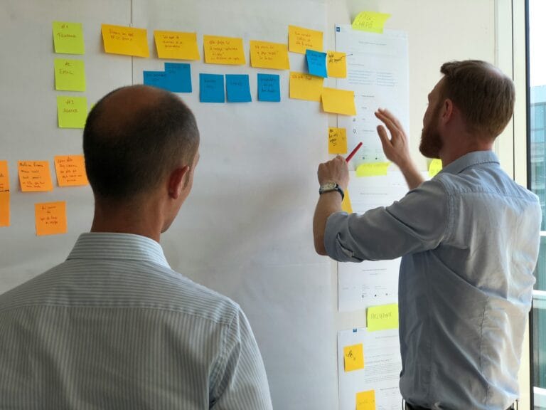
When it comes to proving the power of UX design, few things are as convincing as a well-documented case study. These success stories not only highlight the transformative impact of user-centric strategies but also provide actionable insights for businesses looking to optimize their own conversion funnels. Let’s dive into some standout examples that demonstrate how effective UX improvements have led to significant boosts in conversion rates.

Blikket: Streamlining the User Flow
At Blikket, we undertook a comprehensive user flow analysis to identify friction points within the conversion funnel. By observing user interactions, we discovered that the checkout process was a stumbling block for many visitors. Our team implemented a series of UX improvements, including simplifying the checkout steps and enhancing mobile responsiveness. These changes resulted in a marked increase in completed transactions, illustrating the direct impact of a user-friendly design on conversion rates.
HubSpot: Reducing Response Time
HubSpot’s journey to better UX is another compelling story. Faced with declining user satisfaction due to sluggish response times on their record page, HubSpot conducted extensive usability testing. By optimizing data display and reducing unnecessary elements, they managed to cut the average email response time significantly. This not only improved user satisfaction but also contributed to a 33% increase in revenue growth, showcasing the ROI of strategic UX enhancements.
SEOcrawl: Doubling the User Base
Another inspiring case comes from SEOcrawl, which partnered with Eleken to overhaul their platform. Through a meticulous redesign process that focused on user feedback and competitor analysis, SEOcrawl was able to double its user base. Improvements included a revamped interface and the introduction of new tools like the Crawler and SEO Monitor. These enhancements not only met user needs but also attracted new paid customers, highlighting the role of UX in driving business expansion.
ZebPay: Enhancing Trading Experience
ProCreator’s redesign of ZebPay serves as a textbook example of tailoring UX to diverse user skills. By implementing features such as real-time order tracking and personalized portfolio management, ZebPay made cryptocurrency trading accessible to both novices and seasoned traders. This redesign not only improved user satisfaction but also bolstered engagement across the platform, proving that thoughtful UX can bridge the gap between complex functionality and user-friendly design.
These case studies underline a fundamental truth: investing in UX design is not just about aesthetics—it’s a strategic move that can significantly enhance the conversion funnel. By focusing on user needs and continuously optimizing the experience, businesses can achieve remarkable results.

When it comes to enhancing your eCommerce site’s conversion funnel, the key lies in a systematic approach to UX improvements. Let’s walk through actionable steps that can transform your website from just another stop on the internet to a conversion powerhouse.
Step 1: Map Your Customer Journey
Understanding your customer journey is the cornerstone of any successful UX strategy. Begin by outlining the stages of your conversion funnel: Awareness, Interest, Decision, and Action. Use tools like Miro or Lucidchart to visually map each touchpoint. This visualization helps identify potential bottlenecks and opportunities for engagement. By clearly delineating each stage, you can better tailor your UX design to guide users effortlessly from one step to the next.
Step 2: Set Up Conversion Points and Track User Behavior
Next, dive into Google Analytics to set up conversion points. This involves marking key interactions like form submissions or purchases as conversion events. By monitoring these events, you can gain insights into how users interact with your touchpoints and identify where drop-offs occur. Tools like Hotjar can complement this by providing detailed heatmaps to visualize user interactions on your site. For more insights on optimizing these elements, check out how Conversion Rate Optimization can boost your eCommerce success.
Step 3: Audit Your Conversion Rates
Conduct a conversion rate audit to pinpoint areas needing improvement. Use Google Analytics’ funnel exploration tool to track user progression through each stage. This analysis will highlight where users are dropping off, allowing you to focus on optimizing those specific areas. Often, simplifying the checkout process or improving product descriptions can make a significant difference in reducing abandonment rates.
Step 4: Prioritize UX Design Changes
With data in hand, it’s time to implement UX design changes. Tools like Figma or Sketch are excellent for creating or refining webpage elements. Focus on simplifying navigation, enhancing mobile responsiveness, and ensuring that calls to action are clear and compelling. A/B testing can be invaluable here, allowing you to compare different design elements and determine which changes lead to higher engagement.
Step 5: Segment Your Audience
Segmenting your audience based on their position in the conversion funnel can provide deeper insights into user behavior. Group customers into categories such as those who visited product pages but didn’t purchase versus those who completed the checkout. This segmentation allows you to tailor your marketing efforts and UX design to address specific needs and behaviors of each group.
Step 6: Measure, Monitor, and Iterate
Finally, continuously measure and monitor the impact of your UX improvements. Use tools like Optimizely for ongoing A/B testing and keep refining your strategies based on user feedback and data insights. Remember, optimizing your conversion funnel is an ongoing process that requires regular tweaks and adaptations to stay ahead in the competitive eCommerce landscape. Discover more strategies in eCommerce Secrets.
By following these steps, you can create a more efficient and user-friendly conversion funnel that not only increases sales but also enhances overall customer satisfaction.

In the rapidly evolving world of eCommerce, the significance of UX design cannot be overstated. It’s not just about making your website look good; it’s about creating an experience that feels intuitive and satisfying for users. This is crucial because, at its core, UX design is all about understanding and catering to user needs, ensuring they have a seamless journey from awareness to action within the conversion funnel.
Why is integrating UX design into your eCommerce strategy so vital? Simply put, a well-designed user experience enhances customer satisfaction, boosts conversion rates, and ultimately drives sales. As highlighted in recent insights, a compelling UX can significantly minimize cart abandonment rates and improve overall customer loyalty. This is achieved through elements such as intuitive navigation, fast loading times, and responsive design that adapts across devices, making it easier for users to find and purchase products.
Moreover, the landscape of eCommerce is fiercely competitive. To stand out, businesses must continuously optimize their UX. This isn’t a one-time effort but an ongoing process of refinement and adaptation. By regularly conducting usability testing and leveraging tools like heatmaps and session recordings, companies can gather valuable user feedback, identify pain points, and implement data-driven improvements. This iterative approach ensures that your platform remains user-friendly and aligned with evolving customer expectations. Learn more about these impactful strategies from Forbes.
As we look to the future, the role of UX in eCommerce will only grow more critical. Emerging technologies like AR/VR and AI-driven personalization are set to redefine shopping experiences, offering even more ways to engage and delight users. By staying ahead of these trends and consistently iterating on UX design, businesses can not only enhance their conversion funnel but also build lasting customer relationships. As noted by industry leaders, adapting to user needs and technological advancements is key to maintaining a competitive edge in the digital marketplace.
In essence, UX design is not just a component of your eCommerce strategy—it’s the backbone. It’s about crafting an experience that is not just functional but delightful, ensuring every interaction counts towards building a loyal customer base. So, as you navigate the complexities of the digital market, let UX design be your guiding star, illuminating the path to success and sustainability.
Let’s Turn Your Conversion Funnel Into a Powerhouse
You made it to the end—and if there’s one thing I hope sticks with you, it’s this: every tweak, test, and UX insight isn’t just making your site prettier; it’s actively shaping the trajectory of your entire conversion funnel. The brands winning in today’s crowded eCommerce space aren’t just “optimizing”—they’re obsessing over each moment of their customers’ journeys.
- Map every stage: Don’t guess where users drop off—track, review, and refine each step of your conversion funnel.
- Let data drive design: Use heatmaps, session recordings, and real-time analytics to uncover friction and spark breakthroughs.
- Design for action, not just aesthetics: Prioritize effortless navigation, direct calls-to-action, and personalization that feels human.
- Iterate relentlessly: What works now might miss tomorrow. User behaviors shift, so lean into constant, informed improvement.
- Make UX a team sport: When everyone—from marketers to developers—buys in, you’ll spot more funnel leaks and fix them faster.
The conversion funnel isn’t a static diagram—it’s a living, breathing pathway powered by genuine empathy for your customers. The numbers are clear: thoughtful UX delivers real results. But now it’s your turn. Where in your funnel do you see the biggest opportunity for a UX breakthrough?
Share your toughest UX challenges or aha moments below—let’s help each other turn those lost visitors into loyal customers.