
Here’s a cold, hard truth: nearly seven out of every ten shoppers abandon their carts before crossing the finish line. If you’re an eCommerce pro, that statistic stings—and it’s probably closer to home than any of us like to admit. So, what’s really killing your conversions? Nine times out of ten, it’s the checkout page design. Your default checkout probably isn’t cutting it, and every extra click, confusing field, or clunky flow could be silently eating into your revenue.
If you’re tired of seeing “Cart Abandoned” in your analytics dashboard, you’re not alone. Today, everyone from solo shop owners to international eCommerce managers is locked in an arms race to make checkout so smooth your customers barely notice it’s happening. The good news? There are practical, proven UX tweaks you can start using this quarter that seriously move the needle. We’re talking about checkout page design strategies that shrink friction, build trust, and turn those “meh, maybe later” shoppers into actual buyers—fast.
In this guide, I’ll break down actionable, real-world tips (backed by the latest CRO studies and expert shops) that will make your checkout process a conversion machine. Whether you’re looking to kill distractions, streamline mobile UX, or just finally banish those “why won’t they buy?” headaches—this listicle is your new secret weapon. Ready to reclaim missed sales? Let’s dive in.
Let’s cut to the chase—checkout page design is where the rubber meets the road in eCommerce. It’s the last hurdle your customers face before sealing the deal. But here’s the kicker: a poorly designed checkout page can turn what seemed like a sure sale into another abandoned cart statistic. So, why does checkout page design hold such sway over user experience and conversion rates?
Why Checkout Page Design Matters
A well-crafted checkout page is like a smooth runway, guiding customers effortlessly to the purchase finish line. However, any bumps along this path—like a cumbersome form or unclear instructions—can prompt a quick exit. As highlighted by Common Ninja, even minor friction at this stage could lead to lost sales, underscoring the need for a seamless and intuitive checkout experience.
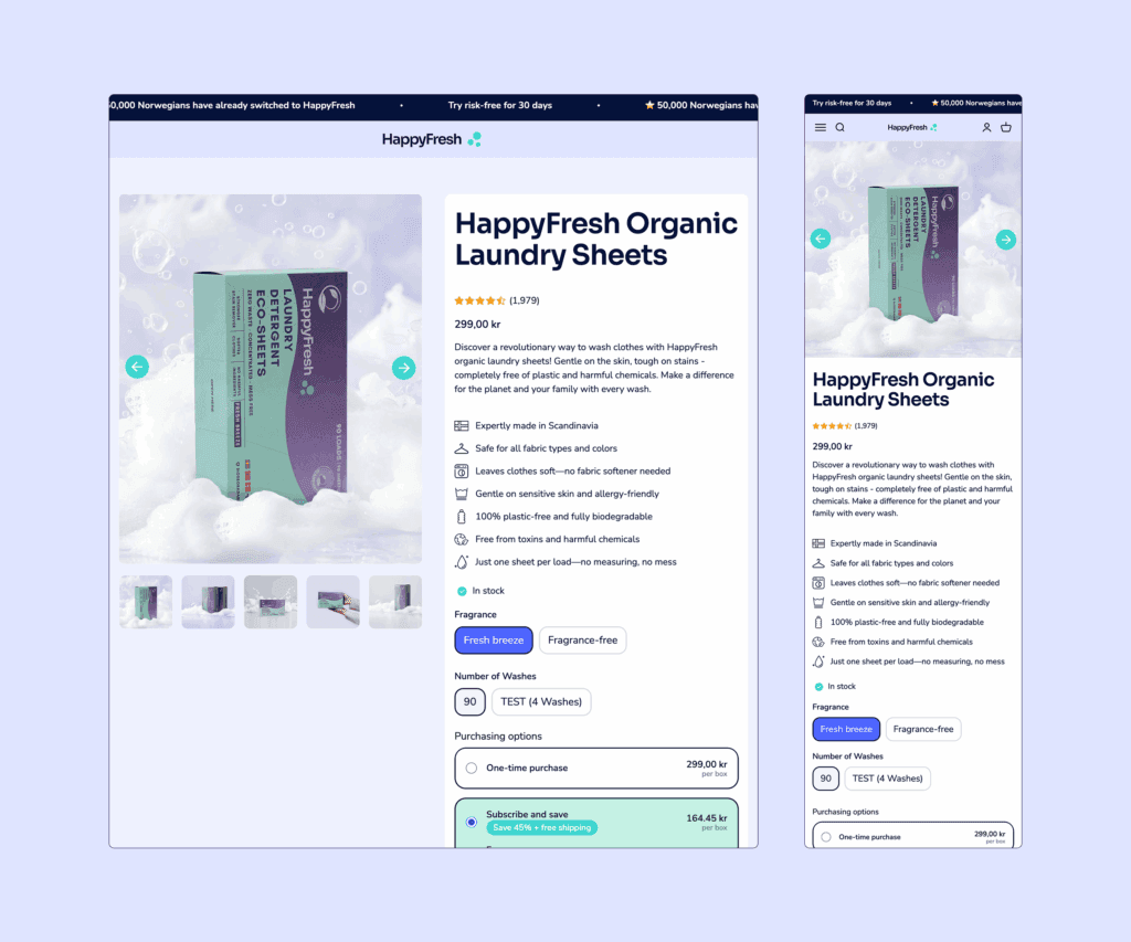
Consider the success story of HappyFresh, which saw a whopping 225% boost in conversion rates through a digital overhaul. This transformation was largely driven by improving their checkout process, showcasing the tangible impact of strategic design on sales.
The Impact on Conversion Rates
The checkout page is the final step in the sales funnel, transforming potential interest into actual sales. A streamlined checkout process minimizes user friction, enhancing the likelihood of purchase completion. Shopify’s own checkout design, for instance, is crafted with conversion in mind, boasting a 15% average improvement over competitors. This reinforces the need for a checkout experience that’s as frictionless as possible.
Key elements such as simplified form layouts, multiple payment options, and guest checkout capabilities are pivotal. These features not only meet customer expectations but also address common pain points like unexpected account creation requirements or limited payment methods, further reducing abandonment rates.
Reducing Cart Abandonment
Cart abandonment is a bane for eCommerce, with the Baymard Institute reporting a staggering 70% of carts are left behind. Many factors contribute to this, including unforeseen costs and complex checkout processes. However, optimizing checkout design can significantly mitigate these issues. For instance, Checkout Page emphasizes the importance of a simple, user-friendly interface, where each step is intuitive and error-free.
By employing strategies like exit-intent popups and retargeting campaigns, businesses can effectively re-engage customers who might be on the verge of abandoning their carts. These tactics, when combined with a robust checkout design, create a comprehensive approach to reducing cart abandonment.
Setting the Stage for Success
The essence of a successful checkout page lies in its ability to convert browsing into buying. By focusing on user-centric design, as outlined in our Checkout UX Best Practices 2025, businesses can ensure their checkout processes are not just functional but optimized for maximum efficiency. This involves continuous testing and iteration, aligning with changing consumer behaviors and expectations.

In summary, optimizing your checkout page is not just about aesthetics; it’s about creating a seamless path to purchase that minimizes obstacles and maximizes conversion opportunities. As we move forward in this article, we’ll dive deeper into actionable strategies to fine-tune your checkout process for maximum efficiency and impact.
Streamlining your checkout process is akin to trimming a bonsai tree—it’s all about precision and focus. You want to reduce the number of steps and fields to create a path of least resistance for your customers. So, how do we achieve this zen-like simplicity in checkout page design?
1. Less is More: Simplifying the Checkout Flow
First off, let’s talk about the power of a single-page checkout. By consolidating all necessary actions onto one page, you eliminate the back-and-forth that can frustrate customers. This approach not only speeds up the process but also minimizes distractions, making it easier for customers to click that all-important ‘Place Order’ button. In fact, transitioning from a multi-page to a single-page checkout has shown to boost conversion rates significantly, as evidenced by a 37% increase reported in a BigCommerce case study. For more insights, explore Checkout UX Best Practices 2025.
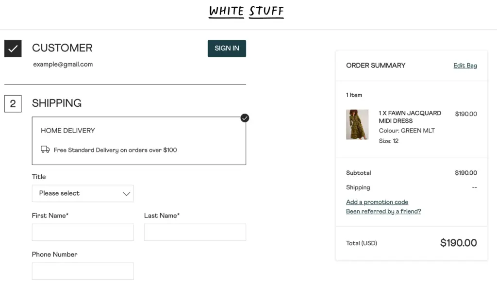
2. Guest Checkout: No Strings Attached
Imagine walking into a store and being forced to sign up for a membership before you can buy anything—sounds off-putting, right? The same logic applies online. Enabling a guest checkout option is crucial for reducing friction. According to Shopify, 34% of shoppers abandon their cart when account creation is required. By allowing customers to complete their purchase without signing up, you’re not only respecting their time but also increasing your chances of making a sale.

3. Autofill: The Magic of Smart Form Filling
Autofill is your best friend when it comes to simplifying data entry. Tools like Google Autocomplete can drastically reduce the time it takes for customers to fill out their details, cutting down on errors and frustration. This feature is not just a convenience; it’s a conversion booster. As noted by Checkout Page, implementing smart form fills can significantly enhance user experience, leading to smoother transactions and fewer abandoned carts.
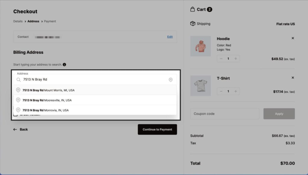
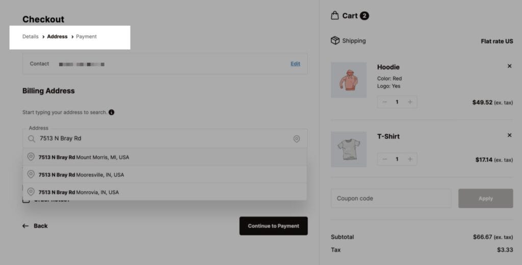
4. Progress Indicators: Guiding the Way
Ever been on a long road trip without knowing how much longer until you reach your destination? Frustrating, isn’t it? That’s how your customers feel without a progress indicator during checkout. A simple progress bar not only alleviates anxiety but also encourages them to complete their purchase. It’s a small addition with a big impact, helping guide users through the process with clarity and assurance.
By adopting these strategies, you can transform your checkout process into a well-oiled machine, one that not only meets but exceeds customer expectations. Remember, checkout page design is not just about aesthetics; it’s about crafting an experience that feels effortless and intuitive. Explore more about User-Centric Design to enhance your checkout process.
Let’s talk about trust—one of the most critical factors in eCommerce success. Building trust through transparency and security is not just a savvy move; it’s essential for improving conversion rates on your checkout page. So, how do you make your customers feel secure enough to hit that ‘Place Order’ button with confidence?
5. The Power of Trust Signals
Trust signals are like the friendly nod of approval your customers need before making a purchase. These include security badges like SSL certificates, which confirm that transactions are encrypted and safe. Displaying these prominently on your checkout page can reassure customers that their sensitive information is secure. According to Prismfly, using trust badges can significantly enhance conversion rates by reducing user anxiety at the point of purchase.
But it’s not all about the badges. Social proof, such as customer reviews and ratings, plays an equally crucial role. Social proof can sway potential buyers by showcasing the positive experiences of others, boosting their confidence in your brand. Integrating user-generated content, like photos or testimonials, further amplifies this effect, making your brand appear more trustworthy and relatable.

6. Clarity in Policies and Pricing
Transparent pricing and clear return policies are your secret weapons in the battle against cart abandonment. No one likes surprises—especially when it comes to unexpected fees. By providing a detailed breakdown of costs upfront, you can eliminate one of the top reasons for abandoned carts. As highlighted by Mailchimp, clear and honest communication about prices and policies fosters trust and encourages customers to complete their purchases.
Furthermore, offering a straightforward return policy can be a game-changer. Customers are more likely to buy when they know they can easily return a product if it doesn’t meet their expectations. This assurance not only mitigates the perceived risk but also enhances customer loyalty.
7. Strategic Placement of Trust Elements
Where you place trust signals is just as important as the signals themselves. Your checkout page is the ideal real estate for security badges and guarantees. A strategically placed badge can be the nudge a hesitant buyer needs to proceed with confidence. For instance, placing a money-back guarantee icon near the ‘Complete Purchase’ button can significantly reduce buyer hesitation, as seen in successful case studies shared by Linear Design.
Consider how HappyFresh, as noted in Blikket’s case study, leveraged these elements to achieve a remarkable 225% boost in conversion rates through a strategic digital overhaul. By integrating trust signals effectively, they transformed their checkout experience into a seamless, anxiety-free zone for customers.
Ultimately, fostering trust through transparency and security is about making your customers feel valued and secure. By doing so, you not only enhance their checkout experience but also lay the groundwork for lasting brand loyalty. As we continue in this article, we’ll explore how these principles can be further optimized for mobile users, ensuring your checkout process is both trustworthy and accessible to all.
Let’s face it—mobile shopping is not just a trend; it’s the new norm. As eCommerce continues to evolve, optimizing your checkout page for mobile users isn’t merely an option—it’s a necessity. With a staggering number of consumers making purchases on their smartphones, ensuring a seamless mobile shopping experience is critical for enhancing usability and boosting conversion rates. So, how do we cater to this mobile-first audience effectively?
8. Responsive Design: The Backbone of Mobile Usability
First and foremost, your checkout page needs to be responsive. This means it should automatically adjust to fit any screen size—be it a smartphone or a tablet—without compromising the user experience. Responsive design is not just about aesthetics; it’s about functionality. A well-designed mobile checkout page eliminates unnecessary zooming or scrolling, making the process as smooth as silk. As highlighted in Blikket’s Mobile Optimization insights, ensuring your site is mobile-friendly can significantly enhance user engagement and reduce cart abandonment.
8. Streamlined Navigation and Intuitive Controls
When it comes to mobile, simplicity is your best friend. Navigating a checkout page on a small screen can be cumbersome if not designed thoughtfully. Implementing large, easy-to-tap buttons and minimizing text input with dropdown menus or autofill options can drastically improve the mobile checkout experience. According to User-Centric Design principles, focusing on the end user’s needs and limitations is crucial for creating an intuitive and seamless shopping journey.
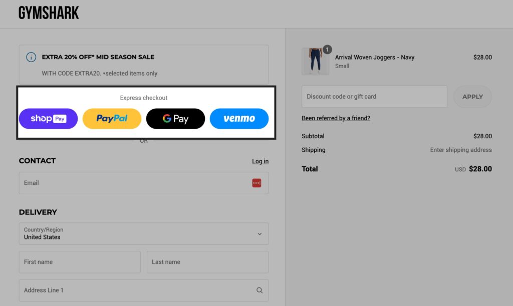
9. Mobile Payment Options: A Game Changer
Offering a variety of mobile payment options is another surefire way to enhance usability. Payment methods like Apple Pay, Google Pay, and PayPal provide a quick and secure way for customers to complete their transactions. By accommodating diverse payment preferences, you not only streamline the checkout process but also build trust with your customers. As noted in the HappyFresh case study, integrating flexible payment solutions can lead to significant boosts in conversion rates and customer satisfaction.
10. Speed and Security: The Twin Pillars
Nobody likes waiting, especially when they’re eager to complete a purchase. Ensuring your mobile checkout page loads quickly is vital. Additionally, displaying security badges can reassure users that their personal information is protected, fostering trust and reducing any hesitation during checkout. As pointed out in Prismfly’s trust signals, these elements are key to enhancing the mobile shopping experience.
By adopting a mobile-first approach to checkout page design, you can create a user experience that feels effortless and natural, ultimately leading to higher conversion rates and happier customers. Remember, the goal is not just to meet expectations but to exceed them, turning mobile shoppers into loyal customers.

A/B testing is like a trusty flashlight guiding you through the murky waters of checkout page design. It illuminates what works and what doesn’t, allowing you to make informed tweaks that can significantly enhance your conversion rates. But what exactly should you be testing on your checkout page to make it a conversion powerhouse?
11. Navigating the Testing Terrain
Let’s break it down. A/B testing involves creating two versions of a checkout page to see which one performs better. You can test various elements, from button colors and call-to-action texts to layout variations. Each component you test can subtly or dramatically affect user behavior and, subsequently, your conversion rates. For instance, a simple change in button color could be the difference between a potential customer completing a purchase or abandoning their cart.
Elements Worth Experimenting
- Button Colors and Texts: The color and wording of your call-to-action (CTA) buttons can significantly impact conversion rates. A/B testing different colors or phrases like “Buy Now” versus “Complete Purchase” can help identify what resonates best with your audience.
- Layout Variations: The arrangement of elements such as form fields, product images, and payment options can influence the flow of the checkout process. Testing various layouts can uncover the most user-friendly configuration.
- Progress Indicators: Adding or modifying progress bars can clarify the checkout process for users, reducing anxiety and encouraging them to complete their purchase.
Data-Driven Decisions
At Blikket, we’ve seen firsthand how strategic A/B testing can drive substantial improvements. Take the case of HappyFresh, for example. By revamping their eCommerce experience with data-driven insights, they boosted their conversion rate by an impressive 225%. This transformation was largely due to continuous testing and optimization of their checkout process.
Implementing A/B Testing in Your Strategy
To get started with A/B testing, you’ll need a clear hypothesis about what you want to improve. Begin with a high-impact element like your CTA button, and use a tool to split your traffic between the original and variant versions. Monitor the results closely—conversion rates, cart abandonment rates, and user feedback are all valuable data points.
Remember, A/B testing is not a one-and-done deal. It’s an ongoing process that should adapt as consumer preferences evolve. By continuously testing and refining your checkout page, you can ensure it remains a frictionless path to purchase, maximizing both customer satisfaction and sales.
Incorporating A/B testing into your checkout page design strategy isn’t just about making changes—it’s about making the right changes that align with your customers’ needs and behaviors.
Ready to Transform Your Checkout Experience?
If there’s one thing we know for certain in eCommerce, it’s this: a killer checkout page design isn’t just about aesthetics—it’s about real results. Every tweak you make is an opportunity to shave off friction and win over hesitant shoppers. Here’s what you can walk away with:
- Streamline everything: Simplified forms, single-page flows, and guest checkouts keep buyers on track (and far from the exit button).
- Build trust, visibly: Security badges, transparent pricing, glowing reviews—each one chips away at cart abandonment rates.
- Embrace mobile-first thinking: Fast, responsive, touch-friendly checkout options are non-negotiable in today’s landscape.
- Test, test, test: A/B testing isn’t just a buzzword—it’s your shortcut to uncovering what actually drives completion on your store.
Your checkout page isn’t just the finish line; it’s the deciding moment where all your marketing, merchandising, and brand building either pay off—or don’t. Small, customer-centric improvements can be the difference between a full cart and an abandoned one (and we’ve all seen too many of those).
If you’re serious about higher conversions, now’s the time to act. Grab one of these strategies, implement it, and watch your numbers shift. Or better yet, challenge yourself: What’s one friction point in your current checkout that you could eliminate today? Drop your thoughts—or your biggest “aha!” moment—in the comments below.
Your next conversion win could be just a single click away. Let’s make it happen.