Ever notice how a tiny arrow or a splash of color can send your shoppers straight to that “Add to Cart” button—without them even realizing it? As digital entrepreneurs, we’re fighting for milliseconds of attention in a landscape more crowded (and competitive) than a Black Friday checkout line. If you’re still treating visual cues like mere decoration, you’re missing out on some of the quickest wins in conversion-boosting UX.
Here’s the deal: Visual cues aren’t just pretty accents. They’re your site’s silent salespeople—arrows, icons, color blocks, and clever contrasts steering users exactly where you want them to go. Research shows that our brains are naturally wired to process images and symbols faster than text, making visual cues mission-critical for eCommerce navigation, user engagement, and (let’s be honest) closing those sales. Think of them as digital road signs, guiding your customers from the homepage to checkout with as little friction—and as much delight—as possible.
So if you’re ready to outmaneuver your competition, stick with me. We’ll break down exactly how the smartest eCommerce brands use visual cues to nudge, direct, and convert—plus, you’ll grab actionable tactics to make your own store’s UX irresistible (and your conversion rates happier than ever).
Have you ever found yourself just about to click on a product, only to realize that it was the color contrast or that strategically placed arrow that guided you there? Well, my friend, you’ve just experienced the magic of visual cues in eCommerce. These sneaky little design elements might seem insignificant at first glance, but they pack a punch when it comes to user experience (UX) and conversion rate optimization (CRO). Let’s dive into what visual cues are and why they’re the unsung heroes of the digital marketplace.
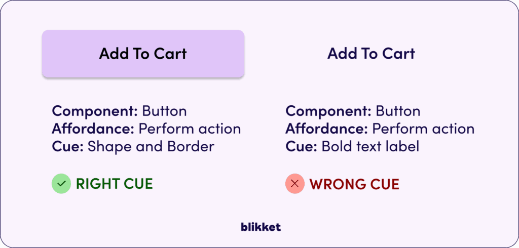
So, what exactly are visual cues? In the simplest terms, they are visual elements on a webpage that subtly guide users’ attention and actions. Think of arrows pointing towards a “Buy Now” button, or a contrasting color scheme that highlights a special offer. These cues are like the GPS of your online store, steering users towards what you most want them to see or do.
Why are they important, you ask? In today’s hyper-competitive eCommerce landscape, where every pixel matters, visual cues play a pivotal role in enhancing UX by making navigation intuitive and seamless. They are crucial for CRO because they can significantly influence a user’s journey, making it easier for them to find what they’re looking for and, ultimately, make a purchase.
The digital market is crowded, and standing out is no walk in the park. Visual cues help you cut through the noise by providing a clear path for your users, improving their overall experience and boosting your conversion rates. As we move forward, understanding and leveraging these cues will be crucial for any eCommerce business looking to thrive.
Why Visual Cues Work: Unpacking the Psychology
Alright, let’s get into the nitty-gritty of why visual cues are more than just pretty design elements—they’re rooted in solid psychological principles. Ever heard of attention theory? It’s the idea that our brains are wired to focus on certain stimuli amidst a sea of distractions. In the digital world, visual cues are your secret allies, grabbing attention and directing it exactly where you want it. Think of them as the neon signs along a bustling street, ensuring your eCommerce site stands out in the online crowd.
The Power of Visual Hierarchy
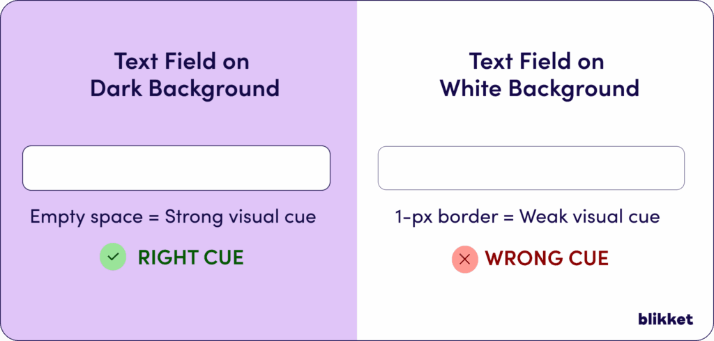
Now, let’s talk about visual hierarchy. Imagine walking into a grocery store where the shelves are organized in a way that naturally leads you from one product to the next. That’s visual hierarchy in action. In eCommerce, this principle is crucial. By strategically using size, color, and placement, you can guide your customers’ eyes through your page as smoothly as a hot knife through butter. Visual hierarchy helps prioritize information, ensuring that users notice your key products and CTAs first.
Designing with Psychology in Mind
So, how does understanding these psychological principles translate into designing an effective eCommerce site? Here’s the scoop:
- Attention-Grabbing Elements: Use contrasting colors and bold fonts to highlight critical areas, like sales or limited-time offers. This taps into attention theory by making these elements stand out.
- Logical Flow: Organize content in a way that makes sense to the human brain. Start with attention-grabbing headlines and guide users through a narrative that leads to conversion.
- Prioritization: Decide what information is most important and use visual hierarchy to make it prominent. This could mean larger images for top products or a bigger “Buy Now” button that’s hard to miss.
By harnessing these psychological principles, you’re not only optimizing your site’s design but also setting the stage for a user experience that feels intuitive and engaging. And honestly, who doesn’t want their eCommerce site to be the belle of the digital ball?
Directional Arrows: Pointing the Way
Let’s kick things off with an oldie but a goodie—directional arrows. Think of them as the digital equivalent of someone physically pointing you in the right direction. In eCommerce, arrows are often used to guide users toward key actions or areas on a page, like a checkout process. A savvy use of arrows can be the difference between a user who’s meandering aimlessly and one who’s guided effortlessly to your desired destination.
Color Contrasts: Making Elements Pop
Next up, let’s talk colors. Ever noticed how a bright red “Sale” sticker on a product shelf grabs your attention? That’s color contrast doing its magic. In the digital realm, using contrasting colors can make certain elements stand out, like a “Buy Now” button that seems to leap out at you from the screen. By smartly deploying color contrasts, you can highlight promotions or draw attention to special features, ensuring that your users don’t miss a beat.
Whitespace: The Unsung Hero
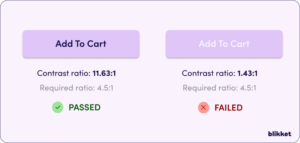
Whitespace, or negative space, might sound like the absence of design, but it’s actually a powerful visual cue. Imagine trying to read a book with no paragraphs or spaces—chaotic, right? Whitespace helps break up content, making it easier to digest. It provides breathing room and allows the user’s eyes to focus on what truly matters. In eCommerce, whitespace can be your best friend, giving prominence to key products or CTAs without overwhelming your visitors.
Icons and Imagery: Speaking Louder Than Words
Icons and images are like the emojis of the eCommerce world—small yet mighty. They quickly convey meaning and can guide users through a site without needing lengthy explanations. A shopping cart icon, for instance, universally signals where users can view their selected items. By incorporating intuitive icons and engaging imagery, you enhance navigability and create a more user-friendly experience.
These visual cues are not just bells and whistles; they’re crucial tools in your eCommerce toolkit. By deftly applying them, you’re not only guiding user behavior but also crafting a more intuitive and enjoyable shopping experience. And who wouldn’t want their site to be the digital version of a well-organized, inviting store?
Let’s dive into some juicy case studies that showcase how top eCommerce brands have mastered the art of visual cues to boost conversions. These examples will give you a front-row seat to the strategies that have turned visual cues into conversion superstars.
Bubble: Emojis and Arrows Stealing the Show
First up, meet Bubble. This brand has turned emojis into conversion allies. By using heart emojis strategically on their product pages, they’ve captured the attention of 71% of Gen Z shoppers who find emojis in advertising irresistible. Coupled with directional arrows that guide users effortlessly across the page, Bubble ensures that users’ eyes are where they need to be—on the purchase button. According to ConvertCart, these elements have significantly boosted conversion rates, proving that sometimes, a wink 😉 goes a long way!
Examples of great usage of visual cues
Anthropologie: The Color Swatch Magic
Now, let’s talk about Anthropologie and their colorful magic. Anthropologie uses color swatch variations to visually communicate product options—a tactic that plays on color psychology. With 85% of customers influenced by colors, this approach makes the decision process a breeze and enhances user experience. Just imagine browsing through a sea of options and finding that perfect shade with ease—it’s like shopping euphoria!

Photo by Anthropologie
Aesop: Interactive Galleries for User Engagement
Next, we have Aesop, a brand that’s all about choice. Their interactive galleries allow users to add or remove items from bundles with a simple click, thanks to engaging visual cues like checkboxes. This freedom of choice not only enhances user experience but also reduces decision paralysis. Talk about making users feel like VIPs in their shopping journey!
Warby Parker: Visual Cues in Search
Warby Parker has taken search to a new level by incorporating product images as visual cues in their search results. This clever move not only enhances product discovery but also boosts conversions by 1.8x. With 50% of customers reporting that images helped them decide what to buy, high-quality product photos have effectively turned search into a visual adventure.

Bonobos: The Power of Quick View
Last but not least, Bonobos introduces a Quick View feature that offers users a sneak peek of products without leaving the current page. This navigational cue enhances usability by reducing the steps needed to make a purchase decision. It’s like having a personal shopper who knows exactly what you want before you do!
These case studies underscore the fact that visual cues are more than mere design elements—they’re powerful tools that guide user behavior, enhance shopping experiences, and, most importantly, drive conversions. As these brands have shown, when you get the visual cues just right, the results can be nothing short of magical. For more insights, check out eCommerce secrets to boost your sales.
Getting Started with Visual Cues
Alright, let’s roll up our sleeves and get into the nitty-gritty of implementing visual cues on your eCommerce site. Think of this as your DIY guide to turning your online store into a conversion magnet using visual cues.
Step 1: Identify Key Areas for Visual Cues
First things first, you need to pinpoint the areas on your site that would benefit most from visual cues. Is it your “Add to Cart” button that needs a little extra oomph? Or perhaps your product images could be more engaging? Identifying these hotspots is crucial for prioritizing your efforts.
Step 2: Choose the Right Visual Cues
Once you’ve identified the key areas, it’s time to select the right visual cues. Here are a few options to consider:
- Directional Arrows: Use them to guide users toward important elements like CTAs or navigation menus.
- Color Contrasts: Make your buttons pop with contrasting colors to draw attention.
- Whitespace: Give your content room to breathe, making key elements stand out without overwhelming your users.
- Icons and Imagery: Integrate intuitive icons to enhance navigation and engage users.
Step 3: Implement and Test
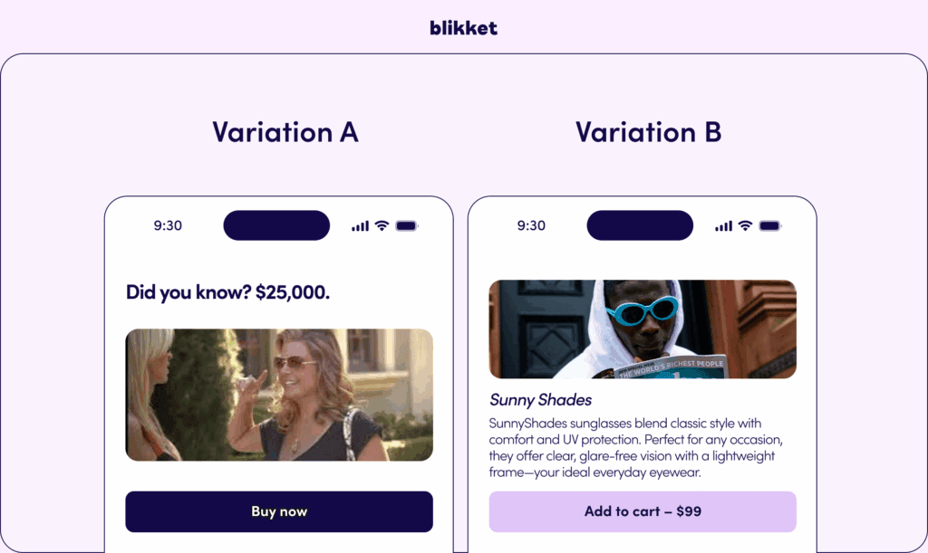
With your visual cues selected, it’s time to implement them. But hold on! This isn’t a set-it-and-forget-it situation. Testing is your best friend here. Use A/B testing to measure the effectiveness of different visual cues. Are users clicking more on a button with a red background versus a blue one? Is an arrow helping guide users better than a suggestive image? These insights are gold.
Step 4: Optimize for Mobile
Don’t forget about your mobile users! Mobile browsing is huge, and your visual cues need to be just as effective on smaller screens. Simplify where necessary—sometimes less is more. Test gestures like swiping and tapping to ensure your cues are intuitive and enhance the user experience.
Step 5: Analyze and Adjust
Finally, keep an eye on your analytics. Track metrics like click-through rates (CTR) and conversion rates to gauge the impact of your visual cues. If something isn’t working, don’t be afraid to tweak and try again. The digital landscape is ever-evolving, and your visual cues should be too.
By following these steps, you’ll be well on your way to integrating visual cues that not only captivate but convert. Remember, it’s all about guiding your users effortlessly through your eCommerce site, making their shopping journey as smooth as possible while boosting your bottom line.
The future of visual cues in eCommerce is as bright as a neon sign on a moonless night. As we’ve discussed, these subtle design elements aren’t just extras—they’re crucial in steering customers where you want them to go, enhancing the user experience, and boosting conversion rates. But what’s on the horizon? Let’s dive into how visual cues are set to evolve and continue shaping the e-commerce landscape.
Visual Search: The Game Changer
Visual search is poised to be a game-changer in the eCommerce world by 2025. Imagine snapping a picture of that chic sofa you spotted in a café and instantly finding similar products online. This AI-driven technology, highlighted by Adlift, allows consumers to search using images rather than text, making the shopping experience more intuitive. It’s a huge leap forward, especially for those of us who struggle to put our fashion desires into words.
Augmented Reality and Visual AI: Friends Forever
Visual AI is not just about making your product images pop; it’s about creating an engaging, personalized shopping journey. With the integration of Augmented Reality (AR), shoppers can virtually try on clothes or visualize how a piece of furniture fits in their living room. This tech duo is expected to reduce return rates and improve customer satisfaction, as shoppers can make more informed decisions. Hypotenuse AI suggests that these advances in AI algorithms will also refine image recognition, making searches faster and more accurate.
The Rise of Voice and Visual Search Hybrids
Why settle for one when you can have both? The future might just be a blend of voice and visual search capabilities. Imagine describing a product verbally while uploading an image for precise results. This combination will provide a more inclusive and seamless shopping experience, especially as mobile voice search continues to expand globally.
Challenges Ahead: The Price of Innovation
Of course, with great power comes great responsibility. Implementing cutting-edge visual search technology isn’t without its challenges. The costs of development and ongoing maintenance can be hefty, and there’s the ever-important issue of data privacy. Retailers must ensure they’re not only wowing customers but also protecting their data like a hawk guarding its nest.
As the eCommerce landscape continues to evolve, visual cues will remain a powerful tool in any marketer’s arsenal. They are the unsung heroes that guide, engage, and convert. Whether it’s through advanced visual search, AI-driven personalization, or AR integrations, staying ahead of the trends will set the stage for success in this cutthroat digital world.
Ready to Let Visual Cues Work Their Magic?
If you take one thing away from this article, let it be this: smart use of visual cues isn’t a trendy add-on—it’s a necessity in the battle for shopper attention and conversions. When you harness the psychology of attention and design with purpose, you’re not just making your eCommerce site prettier. You’re building faster paths to “yes,” smoother shopping journeys, and a brand experience customers don’t want to leave.
- Sharper Focus, Happier Shoppers: Thoughtful color, contrast, and directionals guide your customers exactly where you want them to go, slashing friction along the way.
- From Browsing to Buying: Visual cues transform hesitation into action by making next steps obvious—and irresistible.
- Continuous Advantage: The best brands treat visual cues as an evolving toolkit, not a set-it-and-forget-it feature. Regular testing and tweaks mean higher conversions and fewer missed opportunities.
So, where do you go from here? Audit your site for opportunities to add—or refine—visual cues that clarify, nudge, and delight. Test, measure, and don’t be afraid to get bold with your experiments. And as the digital world keeps changing, stay curious. Imagine: if a tiny arrow or subtle highlight could mean thousands more in sales, what visual cue will you try next?
Let’s keep the conversation going. What’s the most surprising way visual cues have helped (or hindered) your eCommerce results? Drop your thoughts, stories, or questions below—your insight might spark the next big win for someone else.


