

Let’s be brutally honest for a second: Running an eCommerce brand in 2024 feels a bit like juggling flaming swords—while someone keeps adding more swords. Between shifting algorithms and ever-pickier shoppers, it’s easy to lose sight of what really moves the needle. But here’s a truth that always lands: The way you handle customer touchpoints and UX in eCommerce makes or breaks the game.
Here’s the kicker—too many brands think “good UX” just means a snazzy homepage or smooth checkout. In reality, every single interaction (from a late-night product search to that ‘forgot your password?’ email at 2 AM) is a make-or-break moment that shapes your customer’s loyalty and lifetime value. The brands are quietly eating your lunch. They’re the ones mapping, analyzing, and optimizing those moments on purpose—and it’s not just for vanity metrics. We’re talking step-change improvements in satisfaction, conversion rates, and retention.
In this article, I’ll walk you through a real-world case study where one merchant did more than talk the talk. You’ll see how they pinpointed high-impact customer touchpoints, reimagined their UX, and reaped the results. Expect actual numbers, honest before-and-afters, and practical steps you can try, too, because theory is great, but growth needs proof.
Ready for the inside scoop on what happens when you treat every touchpoint like it actually matters? Grab your coffee—let’s dig in.

You can spot the symptoms almost right away: lagging sales numbers, confused reviews, and abandoned carts piling up like digital tumbleweeds. For many growing eCommerce merchants, the problem isn’t the product—it’s the lack of a unified strategy for customer touchpoints and UX in eCommerce. Customers are left wandering through a maze of disconnected experiences, from a jumbled homepage to a frustrating checkout, never quite sure what to expect at each turn.
The Reality of Fragmented Touchpoints
Let’s be honest: before a cohesive approach is put in place, the customer experience can feel more like a patchwork than an intentional journey. Maybe your email campaigns feel off-brand compared to your product pages, or your site navigation sends visitors in circles. Each customer interaction is isolated, missing the crucial context of what came before—or what should come next.
This chaos has a snowball effect. Every confusing moment or clunky process chips away at the trust you’re working so hard to build, which can have a real impact on your bottom line. Conversion rates stay stubbornly low, and customer satisfaction scores disappoint, all signaling a deeper disconnect. It’s not just a technical issue—it’s an experience issue that spans your entire business.
Strained Metrics, Growing Pains
Today’s marketing leaders know it better than anyone. The post-pandemic surge of new channels and ever-shifting consumer expectations has left even seasoned pros scrambling to align touchpoints. As highlighted by industry experts, old playbooks are failing. The average CMO tenure is now the shortest it’s been in a decade, with many struggling to juggle disconnected efforts across teams and channels, even as the need for a holistic, cross-departmental approach grows ever more obvious (Top Marketing Metrics to Track for Long-Term Success).
When metrics are down, it’s not always a marketing problem—sometimes, it’s a signal that your customer experience needs a hard reset from the ground up.
Setting the Stage for Change
Before partnering with a CX-focused team like Blikket, eCommerce brands often sit in this awkward limbo—doing a lot, but not seeing results. Blikket has seen this firsthand across eCommerce Management and User Experience Design projects: brands with solid products but underwhelming growth because their digital presence is a series of disjointed stops instead of a guided journey.
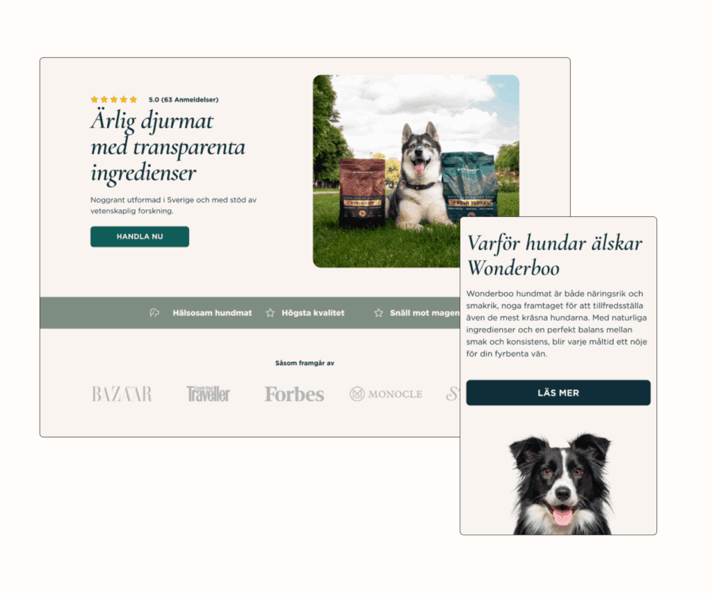
Wonderboo’s story: Before strategic changes, even their premium offerings didn’t translate into strong conversions. Once processes were streamlined and UX redesigned, conversion rates shot up dramatically, marking the pivot from frustration to measurable success.
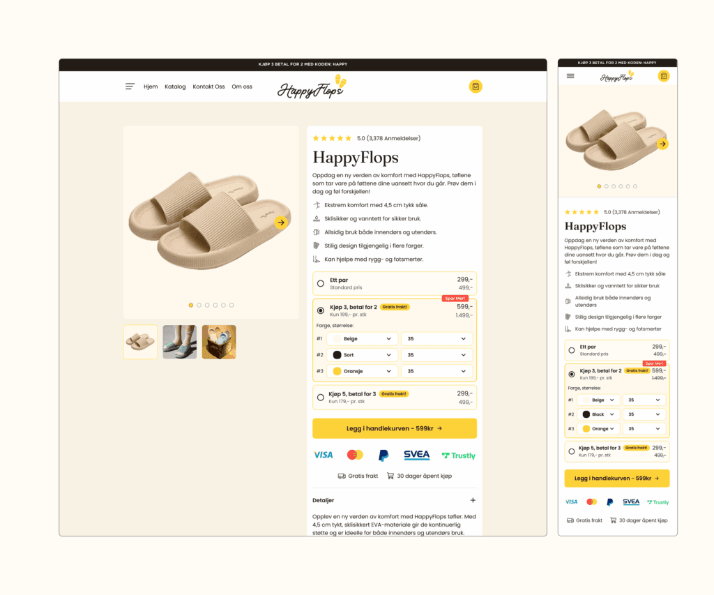
HappyFlops: Despite a loyal base and great product-market fit, fragmented product pages and missed upsell opportunities left their growth flat until touchpoints were fully reimagined.
In short, fragmented customer touchpoints and lackluster UX in eCommerce create invisible barriers that repel customers, and those barriers are reflected in every key business metric. Recognizing this pain is the vital first step to meaningful transformation.
To transform your metrics, it all begins with mapping and analyzing customer touchpoints and user experience in e-commerce. Here’s the hard truth: you can’t fix what you can’t see. So, the very first move? Shine a spotlight on every single customer interaction—before, during, and after purchase.
Customer Journey Mapping: Lifting the Fog
Let’s zoom in. Every brand touch—the homepage visit, cart add, support chat, or even a forgotten promo email—is a potential moment of delight or frustration for your shopper. Mapping these out means literally charting the journey from the first ad click to the post-purchase survey. Think of this mapping exercise like crafting a route up a winding mountain: you want to know every ledge, pitfall, and scenic overlook.
- Start with a touchpoint inventory: List out every brand interaction, both online (website, email, paid social, SMS) and offline (in-store, packaging, events).
- Gather customer feedback: Layer in both quantitative (site analytics, conversion data) and qualitative (reviews, NPS, live chat transcripts) insights to see where customers get stuck—or fall in love.
- Create journey maps: Visualize how different customer segments travel—where curiosity spikes, where friction builds, and where drop-offs happen.
As Qualtrics puts it, mapping every touchpoint is about spotting “pain points” so you’re not just throwing solutions blindly, but fixing the right moments for the right impact.
The Tools and Tactics that Matter
To go from “overwhelmed” to “actionable,” you need structure and the right toolkit. Blikket leverages a blend of analytics platforms, A/B testing, and real customer feedback loops to dig deep and spot chokepoints. For example, when working with Wonderboo, we paired heatmaps and conversion funnel data with direct customer surveys, revealing that seemingly minor UX tweaks could unlock major leaps in conversion rates.
- Heatmaps and Analytics: Zoom in on drop-off zones and high-attention spots across your eCommerce site.
- Surveys and Live Feedback: Proactively ask shoppers where the experience falls short or what they love.
- A/B and Multivariate Testing: Don’t just guess. Systematically test variants of checkout flows, email timing, or even button colors to see what actually moves customer satisfaction and revenue.
Want to get granular? Identify key conversion triggers and blockers. For Rumi Cosmetiques, analyzing each stage—from first impression to “add to cart” to post-sale follow-up—highlighted gaps that, once closed, led to a marked increase in both conversion rates and average order values.
Why Every Touchpoint Counts
Mistakes or friction aren’t just annoyances; they can be major revenue leaks. DataGuard makes it clear—every customer touchpoint is a chance to earn trust or sow doubt. Consistency, personalization, and compliance (think data privacy settings and consent) are non-negotiable in today’s customer journeys.
- Map touchpoints across all channels: web, email, physical, and even support calls.
- Assess for both UX design and legal/compliance issues—no one likes pop-up overload or hidden privacy gotchas.
- Iterate often: Journey maps aren’t one-and-done. Brands winning in eCommerce are always analyzing, refining, and improving.
The more finely you map and analyze, the clearer your opportunities become—and the faster you outrun the competition, both in experience and in trust. For an in-depth exploration of enhancing your eCommerce success, consider reading The Harmonious Dance of CRO and UX.

Let’s cut to the chase: the path to a supreme user experience in eCommerce is paved with decisive improvements—think intuitive navigation, frictionless mobile use, and, yes, a checkout that doesn’t inspire hair-pulling rage. At Blikket, we don’t just theorize about these changes; we roll up our sleeves and get into the nitty-gritty of every digital touchpoint. Here’s how we approached implementation to supercharge customer touchpoints and UX in eCommerce, bumping metrics in the process.
Where We Started: Pinpointing the Pain
After journey mapping and analytics, the obstacles were clear: confusing menus, sluggish mobile performance, and checkout processes with more steps than a dance tutorial. The team’s first step? Prioritize fixes by both impact and ease—high-value pain points like navigation and mobile optimization always rise to the top.
- Deep Dive Diagnostic: We leveraged heatmaps, funnel analytics, and real customer feedback to understand exactly where users stumbled or dropped off. For Wonderboo, analytics showed significant leaks during navigation and cart stages, which meant we needed to declutter flows and highlight trust signals.
- Wireframing & Rapid Prototyping: Early wireframes cut through complexity, helping us test navigation changes or new layouts before code was touched.
- Usability Testing, Fast: Rather than launching big changes and praying, we opted to A/B test micro-interactions and checkout forms, making sure every tweak actually moved the needle for real users—a tactic proven to reveal hidden friction, as seen with HappyFlops’ conversion-boosting product page revamp.
Streamlining Navigation: No One Likes Getting Lost
Smooth navigation is the beating heart of every high-performing eCommerce site. We simplified menu categories, unified labeling across the site, and introduced a persistent search bar. Sounds minor, but these changes helped shoppers find what they needed in seconds, not minutes. According to industry best practices, even seemingly small adjustments to navigation and search can translate to major gains in user satisfaction and site stickiness.
- Mobile-first design: We shifted to mobile-first sitemaps, ensuring thumb-friendly menus and prominent CTAs, supporting rising mobile traffic.
- Breadcrumbs & Clear Hierarchies: Users always know where they are (and how to go back), slashing confusion and bounce rates.
Mobile Responsiveness: Shop Anywhere, Stress-Free
Blikket’s UX team obsessed over mobile experiences, because let’s face it—more than half of eCommerce shopping happens on a phone. We optimized images for fast loading, implemented responsive layouts, and trimmed content to suit every device. As laid out by UXCAM, streamlining load times and prioritizing usability directly boosts conversion and retention.
- Finger-friendly buttons: Increasing button size and spacing reduced unintended taps and smoothed the buying flow.
- On-the-go cart reminders: Persistent, one-click access to checkout made it easy to complete a purchase, wherever inspiration struck.
Checkout Optimization: Make It Easy, Make It Fast
Here’s where a lot of eCommerce brands fall down—the checkout is often an obstacle course. Our team dissected every field and interaction, eliminating the fluff and collapsing multi-step forms. We added trust badges, streamlined guest checkout, and auto-filled customer info wherever possible. Following inspiration from real-world checkout design challenges, the guiding mantra was “no stress, no worries—just pure, hassle-free shopping bliss.”
- Clear progress indicators: Letting users see how many steps remained decreased abandonment rates.
- Multiple payment options: Wallets, cards, and “Buy Now, Pay Later” supported shopper preference and sped up conversion.
Challenges on the Climb
Not everything was smooth sailing. Integrating new UI elements across legacy systems occasionally caused hiccups: edge-case browser quirks, inconsistent load times in rural areas, and resistance to abandoning “the way we’ve always done it.” We tackled these by rolling out phased updates and gathering user feedback at each stage—loops that not only highlighted issues but also gave us the insights to deliver even more personalized experiences.
Real-World Wins from Blikket Clients
When Wonderboo revamped their site navigation and optimized the checkout, they saw a jaw-dropping 178% lift in conversion rates. HappyFlops? A 565% revenue leap, thanks in huge part to the touchpoint redesign and relentless user testing. Blikket’s eCommerce Management and User Experience Design services specialize in these holistic, ROI-driven makeovers—from site structure to mobile optimization to checkout cleanup.
If you focus relentlessly on refining every interaction across customer touchpoints and UX in eCommerce, your numbers—and your customer satisfaction—will thank you.
The Results: Measuring Success and Business Impact
This section could not be generated due to an error.
Here’s the bottom line: Fixing customer touchpoints and UX in eCommerce is never just a “nice-to-have”—it’s the lever that transforms everything from conversion rates to customer loyalty. If you want to drive results like the brands in this case study, keep these key lessons and takeaways at the forefront of your strategy.
1. Make Every Touchpoint Count (and Count Every Touchpoint)
Don’t sleep on the details—every single interaction, from a homepage visit to an order confirmation email, can nudge a shopper toward a purchase or push them away. The brands that consistently win invest serious effort into mapping, measuring, and optimizing every step of the journey. Wonderboo’s 178% jump in conversions and HappyFlops’ 565% revenue explosion didn’t happen by accident—they’re direct results of relentless attention to how customers move, click, and decide.
- Action step: Regularly audit your own customer journey and identify where friction, confusion, or missed opportunities could be dragging down results.
- Pro tip: Blend hard data (analytics, heatmaps) with live customer input (surveys, support tickets) for a 360° view of real-world experience.
2. Eliminate Friction—Especially at Checkout
The checkout process is your “make or break” moment. If it’s clunky or confusing, shoppers drop off fast. Streamlining forms, offering one-page (or one-click) options, providing more payment methods, and supporting autofill can cut abandonment drastically. Simple touch-ups here drive outsized results. For example, usability testing and autofill implementation led to notable conversion bumps for Blikket clients, proving small changes can have big consequences. Don’t underestimate things like error messages, confirmation screens, or transparent pricing—they build trust and reduce anxiety (Boost Your Ecommerce Sales with UX: Effective Strategies).
- Minimize required fields—ask only for what you need.
- Let customers use their preferred payment methods: cards, wallets, BNPL, you name it.
- Keep customers informed—progress bars and confirmation steps reduce uncertainty and increase follow-through.
3. Treat Mobile UX as Mandatory (Not Optional)
More than half of eCommerce traffic now lands on mobile devices. If your site doesn’t nail the mobile experience—think fast loads, thumb-friendly controls, persistent carts—you’re automatically leaving sales on the table. Blikket’s design philosophy centers on mobile-first layouts and frequent prototyping so nothing gets in the way of the shopper, regardless of screen size.
- Prioritize speed—compress images, limit pop-ups, and test on real devices.
- Make buttons and forms fat-finger-proof and easy to navigate (and abandon outdated elements that confuse your mobile users).
4. A/B Test Relentlessly and Iterate Fast
Set-it-and-forget-it is a death wish for eCommerce UX. The tactics that drove a 12.5% conversion rate for HappyFlops—like new product page layouts and personalized cross-sells—were the result of constant A/B testing. The best teams don’t launch and walk away; they monitor, test, and iterate. Continuous optimization means you’re always learning, always improving, and never falling behind.
- Launch changes in micro-increments—test everything from headline copy to checkout flows.
- Sweat the small stuff; a color tweak or copy update can tip the scales for wavering buyers.

5. Build a Feedback and Experimentation Loop
Your customers will show you—in words and behavior—where you’re winning and where you’re falling short. Blikket’s eCommerce Management and User Experience Design services hinge on structured feedback cycles and experimentation. Whether it’s a drop in NPS or a surge in support tickets, treat every signal as a treasure map for your next improvement.
- Set up regular feedback check-ins (surveys, reviews, chat transcripts).
- Closely watch real-world behavior for signals of delight or distress—and use those insights to power your next sprint.
6. Don’t Go It Alone—Leverage Specialists
Yes, you could try to tackle all these UX and touchpoint optimizations in-house. But the fastest-growing brands tap expert teams (like Blikket) who live and breathe customer touchpoints and UX in eCommerce. This shortens your learning curve, slashes wasted time, and sets your brand up for longer-lasting wins. The right partners bring proven playbooks and execute faster—no guesswork required.
Final Thought: Customer-Centricity ≠ Static
What delights (or frustrates) eCommerce shoppers shifts with every trend, device, or tech update. The “secret sauce” is a mindset of continuous improvement. Audit, test, and optimize relentlessly. Borrow what works from proven results, but never stop tuning your site to meet—preferably exceed—customer expectations, every step of the way.
Obsess over the journey, sweat the details, and your revenue (and customers) will reward you.
Your Next Move: Turning Insight into eCommerce Impact
If you’ve made it this far, you already know that customer touchpoints and UX in eCommerce aren’t just industry buzzwords—they’re your unfair advantage. The real-world case we explored proves that reimagining the details of your digital journey leads to measurable business wins. Here’s what this looks like in practice:
- Map every moment: You can’t fix what you can’t see. Lay out each interaction, from first click to post-purchase, and spot the leaks in your funnel.
- Listen, measure, iterate: Use heatmaps, user feedback, and testing to dig into what actually delights (or frustrates) your shoppers.
- Simplify fiercely: Every click, every second shaved off load times, every clearer call-to-action means less friction—and more conversions.
- Embrace mobile-first thinking: If your mobile experience lags, you’re waving goodbye to a huge slice of your audience.
- Make optimization a team sport: Bring in UX specialists or partners (like Blikket does) when you’re ready for step-change growth, not just incremental tweaks.
Here’s the real kicker: exceptional eCommerce experiences aren’t built in one sprint—they’re the result of relentless focus on the customer, and a refusal to settle for “good enough.” The brands dominating their niches? They’re obsessive about the journey, not just the destination.
So, how will you elevate your own customer touchpoints starting this week? Or, better yet—what’s the one piece of friction in your UX that’s begging for a fix? Share your thoughts, swap war stories, or drop your biggest UX “a-ha” in the comments. Let’s turn these insights into action—and make eCommerce better for everyone, one interaction at a time.